1 YEAR OF CASIOPEA WEBSITE!!!!
it's been one whole year since the creation of my site here on neocities dot org!!! wtf!!! it's absolutely wild to me that it's been a year already...I did not expect my sudden fixation
on wanting to code a silly little website to last as long as it has, but! look at how far it's come!
I don't exactly remember the reason I started this site. to be honest I don't think there was a reason other than "coding seems cool as fuck I wanna learn that. I wanna make something like that."
I also don't remember how I came across neocities, but looking through the sites on the featured page gave me that final push and motivation to start learning html and css. and I did!! I pulled an all
nighter trying to piece together my first page. of course it was really shitty but hey, it's a start.
ok I don't really remember the order in which I made my layouts...at the start of my site I made 2 very similar looking layouts for some reason? anyway I'll place them here (they're missing a lot of images rip in peace):
layout 1 (i think)
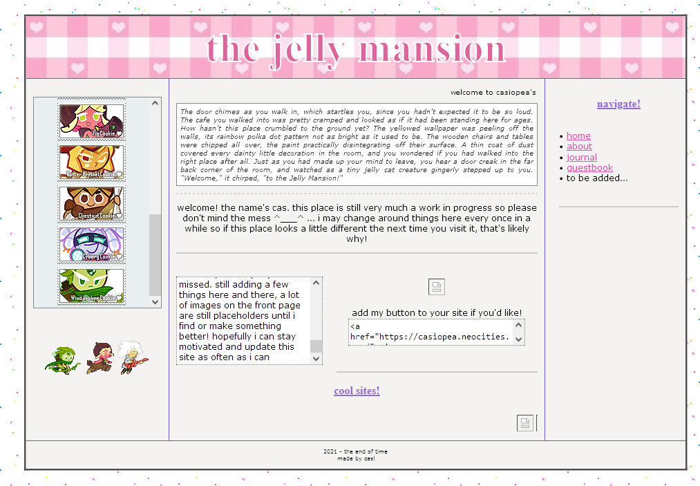
I think this was the first layout I made for the site? as you can see it's a very simple table layout...very standard...
I feel like using a table for your layout is probably the most beginner thing ever honestly lol. I didn't know wtf a "flexbox" or "grid" was back then all I knew was that "table helpful. good layout" so you can't really blame
me for going the table route.
originally I wanted to make my website centered around my characters within the jelly mansion universe, which is why my original theme was "jelly mansion." I've since moved away from that
but I'm don't worry I'm still working on the jelly mansion!!
layout 2 (the exact same thing except switched around)
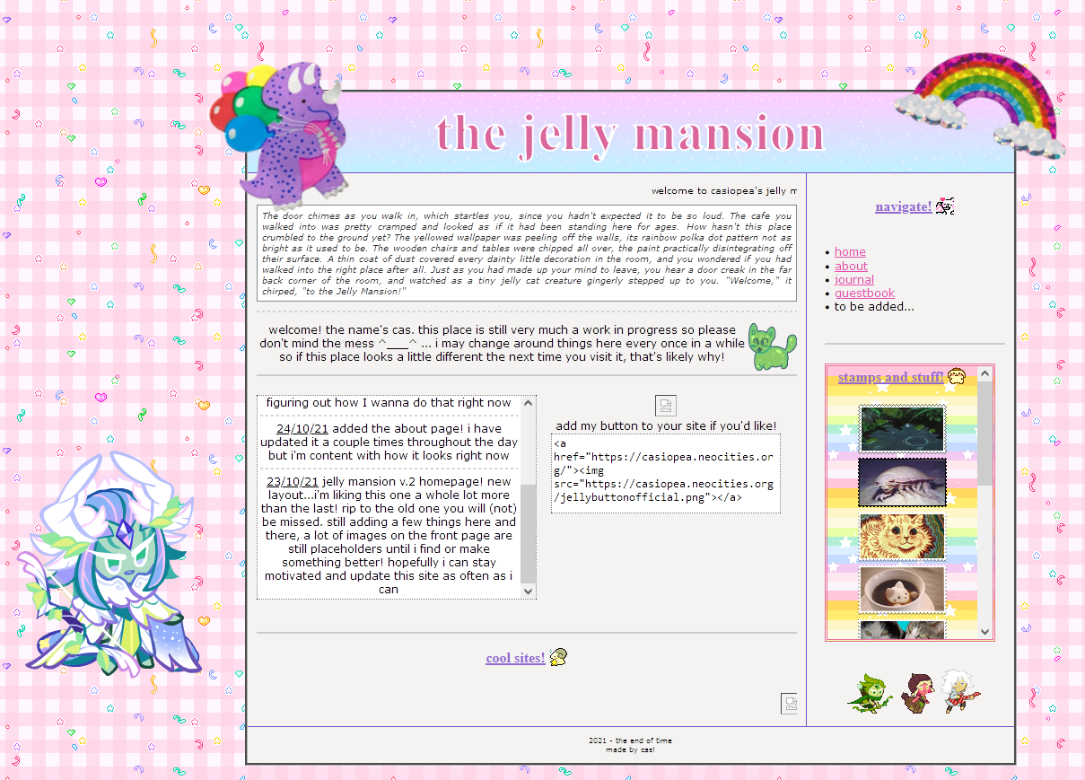
honestly not much happened here other than my sad attempt at adding floating images on top of my layout. like stickers. it did not
work obviously because I did not know what I was doing and it basically messed up my entire page. the secret to floating images/tabs/divs whatever: anchor them down to another div!!! and position: absolute that beast.
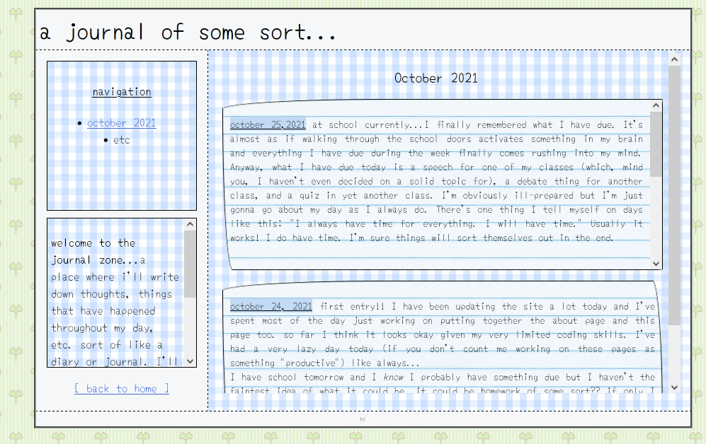
extras: my original about and journal pages
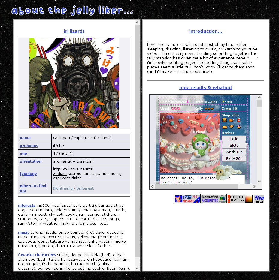
to be honest my about page layout was cute I really liked it. the two column thing was nice and I liked the table thing I had going on where I put some info about me in there...overall pretty neat I guess.
oh I guess an important change that's happened since then is that I no longer identify as aromantic or bisexual so...disregard that...
I think what I did for most of the stuff on my about page was copy + paste
shit directly from another about page I had made prior to this...hence why there's a lot of extra info that nobody gives a shit about (who cares about my favorite characters? besides fig of course.)
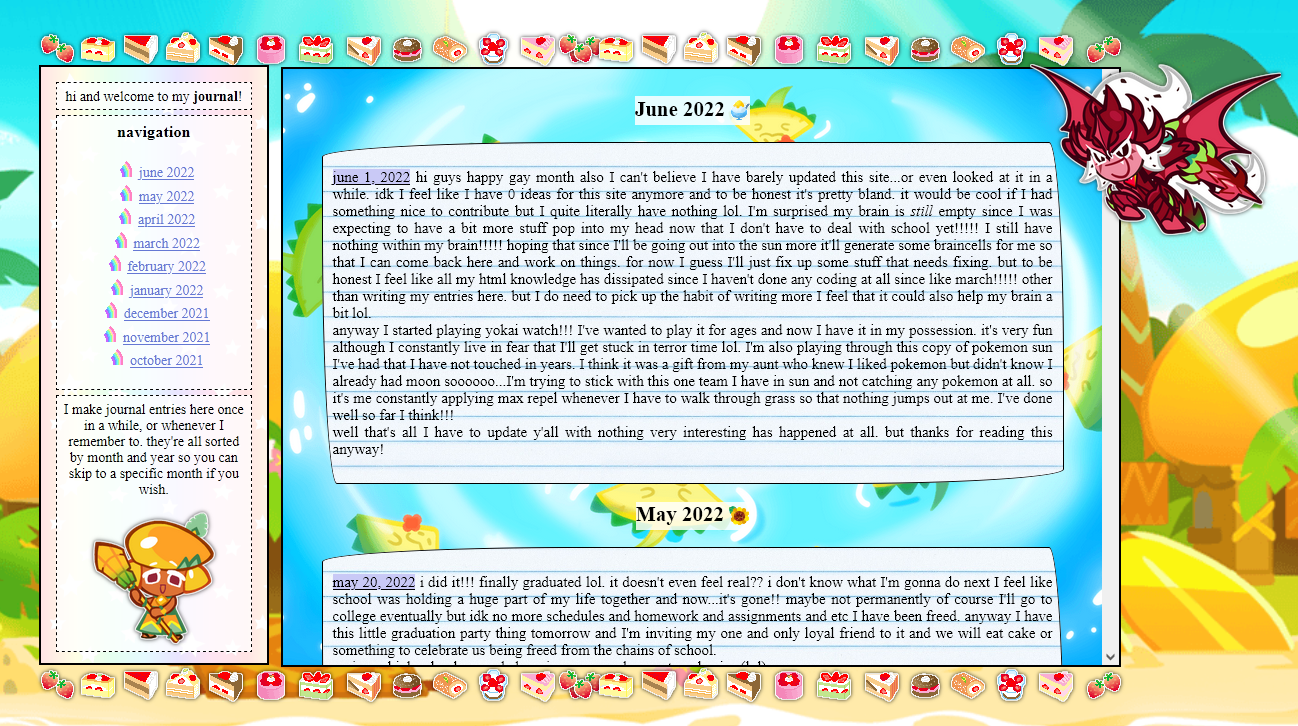
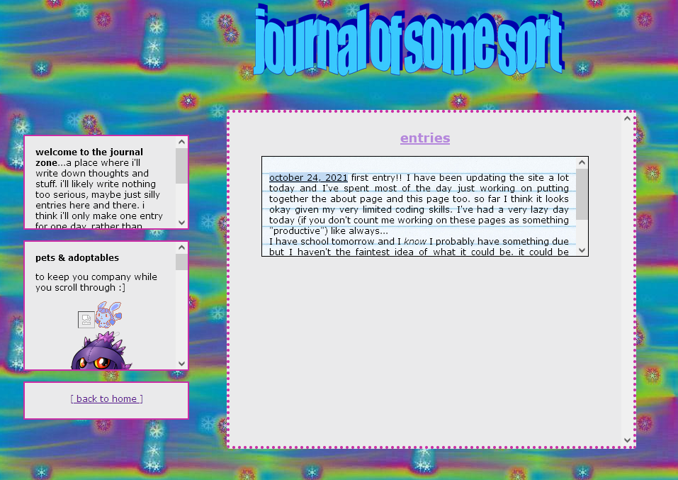
my original journal page is definitely...interesting. it hurts to look at. I think I should've definitely expanded the "entry" div because that thing is so so short!!!! who's gonna scroll through that??? obviously
after I coded this page I realized that but wow that was definitely a choice I made. in my future journal page layouts I've kept the same general layout feel...so not much has changed other than the way it looks.
the next journal page I coded after this stayed like that for pretty much the entirety of the year. it was a decent layout and I didn't feel like changing it at all because what was there to change.
layout 3! iconic
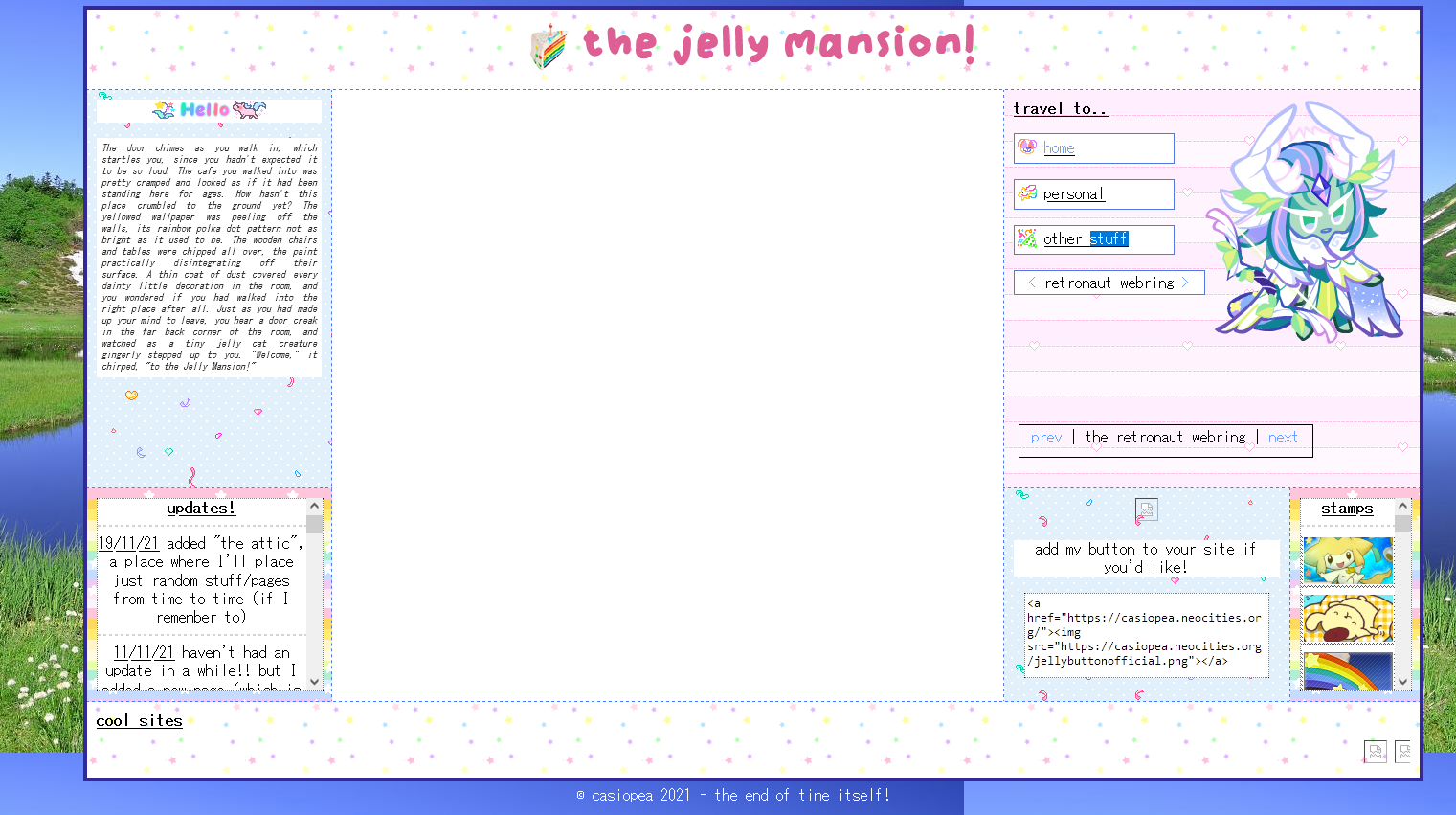
right so. don't ask me where the main chunk of my homepage is in this screenshot because I don't know what happened to it lol. but I feel like this was one of my more iconic layouts probably because I went a while without
changing it after I coded this one. as you can see I kept the table layout theme going since it was the only way I knew how to organize my layout. I added some color to the table boxes though I think that was a nice touch :)
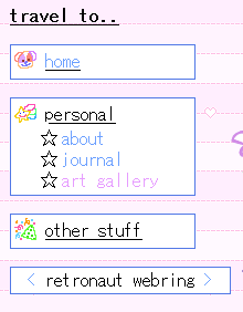 one thing I really liked about this layout that I coded was the navigation links thing! when you clicked on one of the bars under 'travel to...' (for example, you clicked on personal) it would open up and display all the links
under that category. I did it using details + summary elements and styled them from there. and within I placed a list of links :) pretty neat methinks
extras: about page #2 and #3
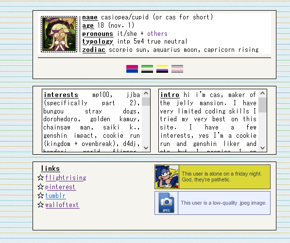
this about goes along with layout #3 and you could open it in an iframe, hence the fact that it's super simple and small. I like that I moved
on to a single column display with various rows and boxes to place info. it was pretty nice. but...too small and simple.
there was a third about layout that was purple and based on computer windows but apparently the completed version of it is not in my files. anyway I found a partial screenshot of the page yippeeeee
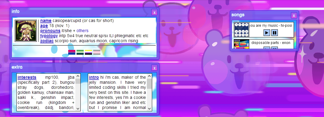
so this about layout was sort of based off computer windows which I spent hours on and painstakingly created. I still like
it a lot! it was creative but it took sooooo so long to put together. the original layout of this page didn't include the little music window, I added that in later.
making the music divs fried my brain honestly. at
that time I had 0 experience with javascript and I wanted a silly little music thing on my about page so badly that I kinda...made something for it. I don't know how please don't ask. that knowledge is lost to time.
layout 4 (looks nice!)
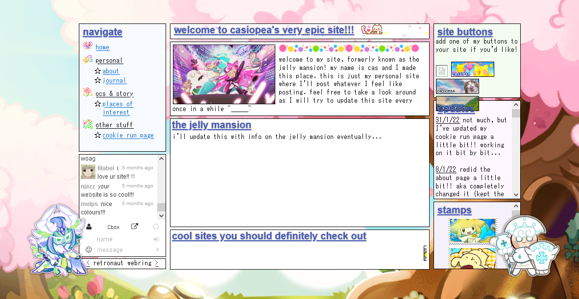
FINALLY!!!! NO MORE TABLE LAYOUT!!! by this point I had a bit more experience coding and was comfortable enough to move onto the next step...flexbox. to be honest I struggled with it a lot but the end result was
so nice!!! by far one of my favorite layouts. it's very well organized and neat!
also I don't know if you've noticed but I finally figured out how to position images onto the page without
it looking fucked up!!! and wind archer has been there pretty much since the beginning. he's the protector of my site of sorts. I can't not have him somewhere on my site!!!
my only gripe with this layout was the fact
that I dedicated the biggest space on the page to the jelly mansion. and never wrote shit in there. it was pretty much blank for the entirety of this layout. I think this is when I realized it was best to move away from the
jelly mansion theme of my site.
extras: my other about pages
after the 4th layout went live, I eventually remade my about page but opted for something simpler still. however I don't have it in my files anymore (why do my about pages keep disappearing) but I reckon it looked something like this?:
 and after this I just gave up and made an even simpler about but I think my frustration with how to make my about page and what to put on it led to me completely redoing my homepage layout yet again! it happens.
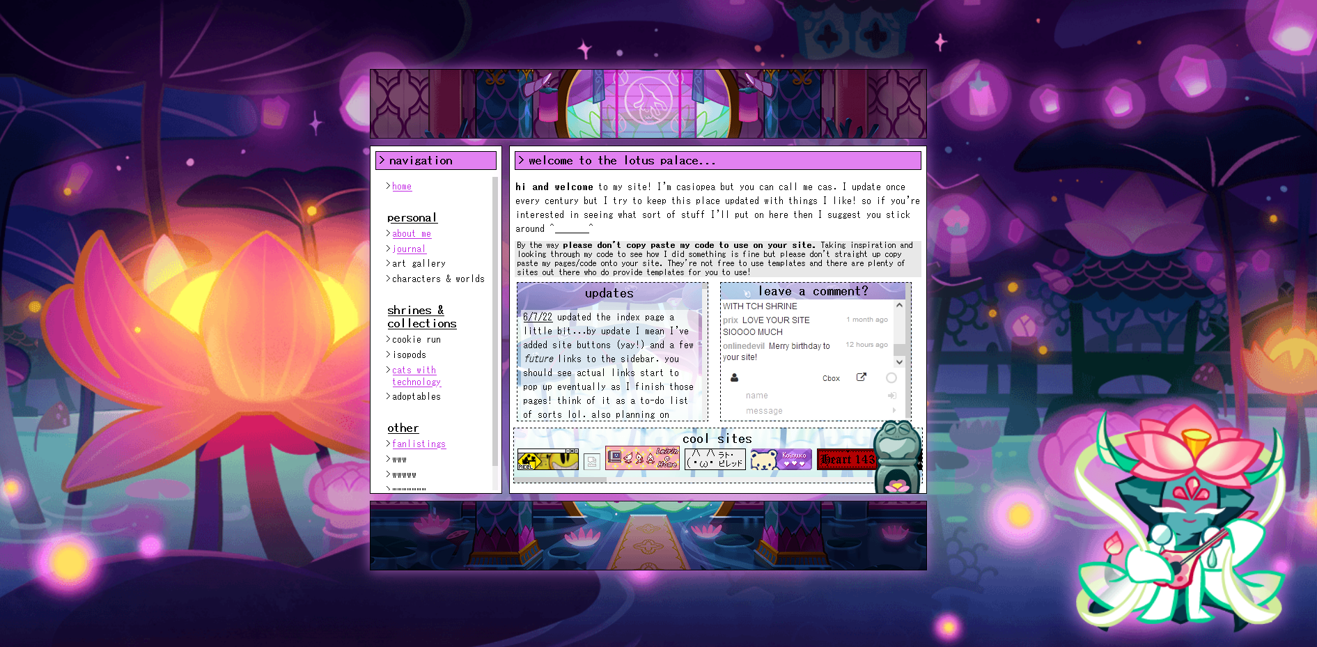
layout 5 (the disappearance of wind archer and introduction of lotus dragon)

behold!!! the layout of all layouts! compact, simple, AND with added matching header + footer! I finally had a solid theme and colors for my homepage. and look! a 100% cookie run themed homepage too! it felt like everything
was finally matching up.
as you can see there is no wind archer to be found here!! instead I added a lotus dragon on the right side of the page.
I think this was a really successful era for my site. or rather, a more motivated era! during this time I added a bunch of new pages to the site and made it less barren. nice!! however out of all the shrines and collections the cookie
run shrine, which I promised to make, was never made. too much work, I thought. also I've been distancing myself from playing that game so what would I even put on that page.
extras: the final about layout + introducing the enter page!
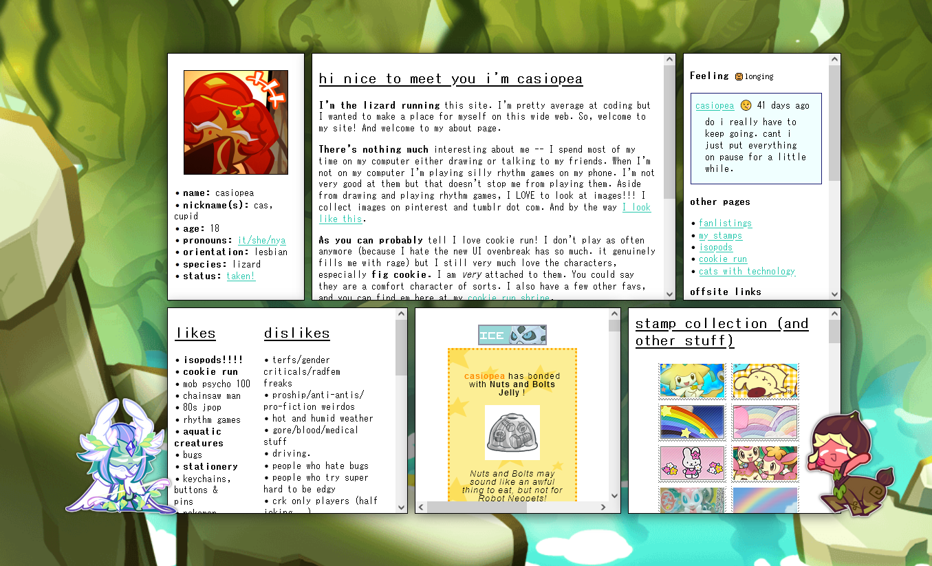
as I mentioned, layout 5 brought a lot of change onto the casiopea site! after remaking my homepage, I finally regained the motivation to create a new and improved about page. I always like to put a lot of effort into my abouts.

a much neater layout that takes up more space than my previous ones. everything has its own section. epic. I added so much more to my about page compared to my old about layouts. it feels like too much now that I look at it. going
forward I'll try to keep it simpler.
wind archer appears yet again! but he's tired now.

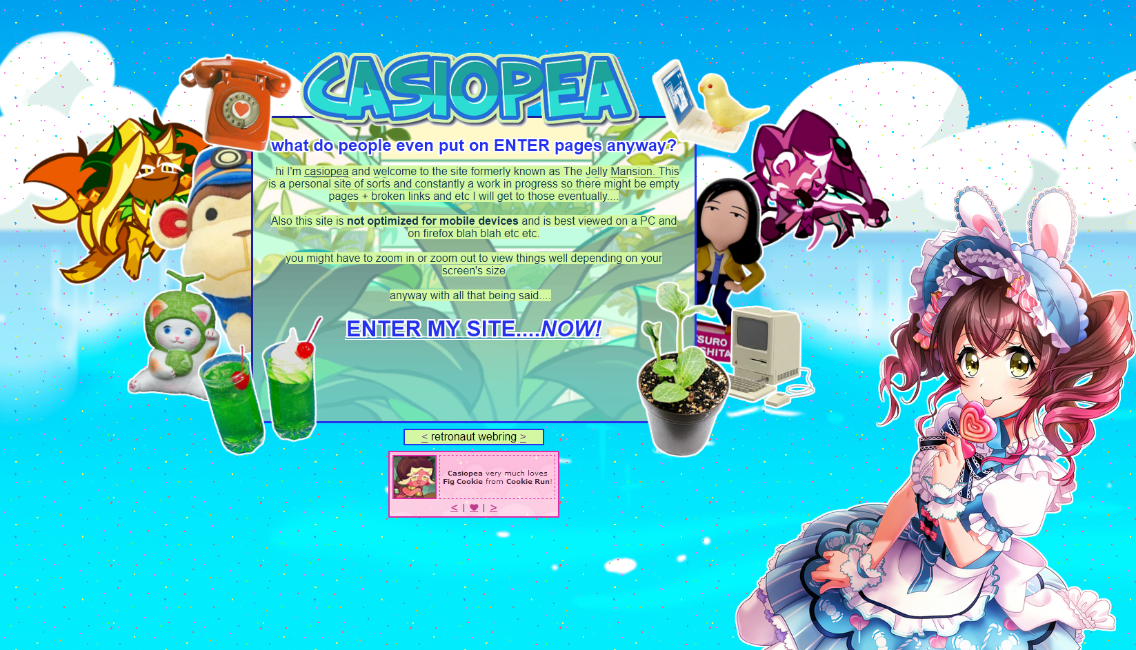
the enter page...I wanted to make this page just to let people know some stuff before entering the site of course. but I didn't want it to be bland! I made it as silly as possible. covered it with trinkets and items. view muni
there in the corner! think of this page as the bright coloration of a bug or the bright feathers of a bird: deters anyone unfit for my page but attracts people who are fit to enter and enjoy. if that makes sense. it's a display of what my personality is like and also
the kinds of stuff you'll find while traveling through my site.
does that make sense? I hope it makes sense.
what happened to the journal page?
the journal page is one of the pages on my site that's gone the longest time without being changed (besides tweaking some minor things) so...what did it look like after the first version?

boxes within boxes. another table layout! one of the remnants of my old site style...
I didn't bother changing it because why fix it if it's not broken? most of my journal entries sound silly but they're not there for
other people, they're mostly there for me. I have a shit memory so writing things down about my day helps me remember.
I did eventually update the journal page after the launch of layout 5 but kept the general layout of the journal page. not much changed other than the divs have been freed from the giant box!!!! yippeee!!!

layout 6 (fig cookie!!!)

and now for my current layout. like all my past remakes, they come from this feeling of frustration, like "my site is so stagnant and boring I need to change something!" and this frustration drove me to create this new
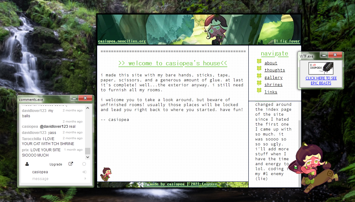
theme!!! fig cookie themed :) because of course I needed to make something themed around my absolute favorite and best friend ever. more green!!! I love green!!!
conclusion
yes there are a lot more pages that I didn't add to this simply because this would get too long...I wanted to center it around the "main" parts of my site! or rather the parts that changed the most. I've come so far in my coding
abilities but there's still a LOT to learn. too much to learn almost...but I want to keep going because I genuinely find coding enjoyable and love seeing the end results of my hours of hard work!
ok that's all I have for today. happy
birthday casiopea.neocities.org !!!!! 1 years old baby wooooooooo
 one thing I really liked about this layout that I coded was the navigation links thing! when you clicked on one of the bars under 'travel to...' (for example, you clicked on personal) it would open up and display all the links
under that category. I did it using details + summary elements and styled them from there. and within I placed a list of links :) pretty neat methinks


 and after this I just gave up and made an even simpler about but I think my frustration with how to make my about page and what to put on it led to me completely redoing my homepage layout yet again! it happens.